
Is Britain Balkanising?
Whether by age, migration, or education - are we flocking together, or coming apart?

Do you remember the farmers protests of 2020? How some people put out flags in their garden to show their support for the farmers union? You don’t?
Some of my constituents do. At the Leicester end of my constituency many people have heritage in Punjab - and in 2020-21 they felt the (Indian) government was treating the farmers there harshly.
Let me try another. Have you been aware of farm protests this year? At the southern end of my constituency a big crowd turned out in Market Harborough to clap the convoy of tractors organised by the NFU to protest against the Family Farm Tax.
If you live in a shire, you will almost certainly will have seen banners and signs for the farmers’ campaign on the roadside. But if you live in a city it may well have passed you by.
Conversely, the terrible state of the Bakerloo and Central lines has probably not affected you by if you live in the deep countryside. Likewise the Palestine protests.
Even in my own small constituency, people can see the world very differently.
There were always differences between places. But there are reasons to think those differences are getting bigger, and in ways that may change our politics a lot. A recent report by the group More in Common, with the jolly title “Shattered Britain” finds an “unprecedented level of political fragmentation.” What are the roots of this?
Voting with our feet
Economists have a concept called “revealed preference” - roughly the idea that you can better work out what people really think from how they spend their money, rather than what they say.
People might say they like a thing, but if they’re only prepared to spend so much on it - or they choose something else at the same price - then that reveals what their real preferences are.
This idea of “voting with your feet” is at the heart of western democracies and market economies.
One way we vote with our feet - and reveal our preferences - is by choosing where to live.
The ONS produce a rich set of data on this, looking at how many people move between places each year, and how old they are and so on.
This post looks at that data. It’s a complement to both the pieces I have written on regional policy (like this one, and this one) and also the pieces on demographics (like this one, this one and my this recent post).
On the move
Without further ado, here is the net number of people who moved into (or out of) each local authority from another place in this country from 2012 to 2023. It does not include the impact of international migration, which is itself of course very unevenly distributed. Because places have radically different population sizes to begin with, to get meaningful comparisons I have given the figures as a share of the population1.
As you can see, people who live in Britain have been moving out of our cities by and large. There’s a big flow out of London, and out of other cities like Birmingham, Coventry, Leicester and Bradford. So how is their population still rising overall? International migration is the main answer, though there are also differences in birth and death rates between places.
This is the total number over a dozen years. Still, for places like Newham to have seen net outward migration equivalent to a third of their population in 2021 is quite a lot. In contrast, places like South Derbyshire and East Devon gained the equivalent of a fifth of their 2021 population.
What do the places that people move away from, and the places they move to, have in common? Even a casual glance at the map above reveals this is broadly an urban-to-rural movement.
And that urban-to-rural exodus seems to be accelerating. If we lump together the local authority areas classified by ONS as “rural” and those classified as “urban” we see an rising trend. There was a bump around Covid. But that bump was not unwound - in fact the rising trend runs right through it. By 2023 the annual “escape to the country” from our urban areas was more than twice as large as it was in 2012, and the population hadn’t doubled in that time (the population of England and Wales had increased 7.5%).
But not all urban areas lost people. Bristol was roughly flat, and so was York. Exeter and Bath gained people. So is this about affluent places then?
No. Liverpool was also flat. And you can see on the map above that a bunch of ex-industrial urban areas that are not wealthy also gained people too: North Tyneside, Wakefield, Barnsley. These are places in conurbations, with cities, but also quite a lot of green space and villages.
What’s driving the movement?
Rather than eyeballing the map, let’s run the numbers and test some theories.
Theory one: maybe people are moving to places where wages are higher?
Nope. There’s little pattern at all. If anything, people are marginally more likely to move away from where wages are higher. The chart below is based on residential earnings too, so it strips out the effect of commuting.
The nice clear upward slope you might expect to see here is non-existent, or even going in the wrong direction from an economist’s point of view. What’s going on?
OK, perhaps earnings aren’t the whole story in expensive cities. We could instead look at incomes after housing costs. The data here is not perfect2, but even accounting for housing costs there’s still no sign that people are moving towards places where they might end up with more money in their pocket after rent or mortgage costs.
OK, what if we look at a whole bunch of measures of deprivation?
If we look across England and Wales at the measures of deprivation in the Census3 (employment, housing, education and health) there’s maybe a very slight trend, but no very clear link.
Can we do better?
England’s Index of Multiple Deprivation (IMD) contains a much more urban-centric definition of deprivation.
The IMD contains things like crime rates, which are higher in urban areas, and the share of people who don’t speak English well, also higher in cities. It also contains measures of the living environment which are urban-focussed - like air quality, and road traffic accidents involving pedestrians and cyclists. It contains housing measures like overcrowding and homelessness which are also urban-focussed. Surely this should show us a link?
Just before we check, here’s a chart showing just how urban-focussed the IMD is. If we compare IMD to earnings we can see almost all rural areas (orange dots below) are below the line: they almost all are below the IMD score you might “expect” given resident’s earnings.
So when we use English IMD we (unsurprisingly) do start to see a bit of a correlation - people are moving away from places with a higher IMD score. But the scatter is still massive, and the trend is surprisingly slight.
We have already started to shade off from economic to social factors. Let’s take that further. How does the share of people moving via internal migration compare to the share who have arrived via international migration?
Compared to the economic and social factors above, the correlation seems much clearer:
The pattern looks similar if we look at more recent migration. And we can run the same sort of analysis using ethnicity rather than migration.
Broadly speaking a 10% higher or lower share of people white British in an area correlated with a 4% higher or lower net internal migration rate - though there is still scatter.
And this is not just an urban-versus-rural story. We can see that places where the share of migrants and ethnic minority people is higher see larger net outflows, even if we were to only look at urban areas.
Flocking together?
Is this evidence of “white flight”? Well in this data there is no information on the ethnicity of those moving between local authorities.
But it is consistent with other studies by people like Eric Kaufmann who have found evidence of such trends in the UK and elsewhere. They use datasets like the Understanding Society Longitudinal Survey and the ONS Longitudinal Survey which do have that kind of information.
In-group preference might be a better term than white flight - not least because the number of people moving falls away with age, and the white population is older than most ethnic minorities (other than people who identify as of Caribbean background).
Whatever the right term, Kaufmann and others find evidence of ethnic preference. For example, in the decade that followed, the white British population increased mainly in local authorities that were over 85 percent White British in 2001, while declining fastest in the most diverse LAs.
Is this just about material factors? No. As Kaufmann notes, “even when a range of socioeconomic controls are applied, own-group preference has a significant effect on neighbourhood destination choice.” The numbers are quite big:
in wards with less than 10 percent nonwhites, white Britons who move select destination wards that are 3.6 to 5.3 points whiter than minority groups originating from the same quintile of wards. The difference widens as we move beyond 11 percent minority in the ward of origin. Among movers who originate in highly diverse wards containing over 40 percent minorities, white Britons are predicted to move to a ward that is fully 10.3 points whiter than a minority individual from a similar ward.
The patterns of movement are complex though. You could say that the result above is the result of white British people relatively preferring their own group or ethnic minorities preferring their own group. Both have agency.
Earnings, education, willingness to tolerate crowding, home-ownership and social housing all play a role, and (as usual) migrants from different places and different ethnic minority groups are far from homogenous in their behaviour. A paper by Coulter and Clark (2019) concludes that:
Ceteris paribus ethnic minorities tend to relocate to less advantaged neighbourhoods and neighbourhoods with a greater share of minorities than their White British peers.
There is a whole deep seam of work on this and a Policy Exchange report of 2022 by Brendan Cox and others does a good job of explaining the many complexities.
Noting any of this implies no criticism of anyone for wanting to live with people like them. Ex-pat Brits abroad do it when we cluster together. There are reasons (both practical and preferential) why people all around the world do this.
Grey-shift?
What else can we say about the other characteristics of where people are moving from and to?
Another clear trend is that people are moving towards older places. While rural places tend to be older, even among urban places there is a trend that net internal migration is towards older places:
Internal migration and the uneven nature of it is one reason why age differences between different parts of Britain are getting bigger - the places with the largest proportions of older people are seeing the fastest growth in the proportion of older people, making the differences bigger:
Places with under 10% pensioners in 2011 had a 0.6% higher share of pensioners over 65 a decade later.
But places with over 20% pensioners in 2011 had 3.7% more pensioners a decade on.
That flocking to older places is one reason why the line below is steeper than 45 degrees:
So older places are getting older, and places with the most international migrants receive the most international migrants, and are more likely to have existing residents move out. This is already a recipe for a country in which the different areas feel more and more different. But there is a third form of sorting going on: clustering by education.
Grad-shift?
That cities have seen growing outflows over this period is all the more surprising as we have had a large and steadily growing government programme to move young people into our cities - namely, higher education.
Young people do move to cities for uni. But then they generally leave again. Rather than sticking, they are what the Centre for Cities calls “bouncers” - moving to cities then churning out again.
Without the expansion of universities, the growth in the outflow would have been all the greater. If we took out the flow to cities among 15-19 year olds the flow to rural areas would have been about 30% greater.
The way we do higher education in Britain is quite unusual internationally, or certainly at one end of the scale. In the UK about 20% of students live with their parents in term. In France that’s more like 40% and in Italy more like 70%.
Higher education is significant in two ways: it causes both sorting and churning.
The following map gives us a typology of places in terms of how they interact with universities.
Blue places saw an inflow of 15-19 year olds and an inflow overall.
Green places saw an outflow in those student years, but a gain from internal migration overall.
Orange places (like Leeds, Manchester, Newcastle) gained students, but still saw overall outflows of people.
Red places lost students - and lost people overall. Those are typically outer urban areas: the less urban bits of West Yorkshire, Greater Manchester, the West Midlands and Outer London.
Life in these different types of places can feel quite different, and the ONS population pyramid for each area shows the impact - orange places have a lot of 20- and 30-somethings relative to other age groups, while green places have relatively few.
Those demographic difference inevitably change the local vibe: Are you getting a flat white from Blank Street, or a cuppa at the Garden centre? Worrying about Brixton gentrifying, or Wilkos shutting?
People like us?
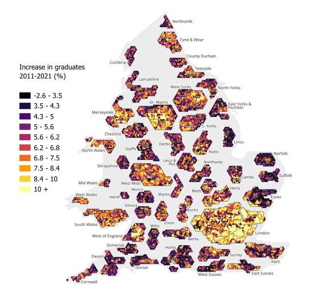
As well as this churning of students, we have seen a strong overall sorting and concentration of graduates over recent years.
The internal migration data doesn’t contain information on people’s education, but we can see the flocking together of graduates from data linking the 2011 and 2021 censuses. Graduates were already pretty concentrated in our cities in 2011, but in the decade that followed the change in the share of people with degrees was much higher in our cities.
The map below makes each neighbourhood (MSOA) the same size so you can see the cities properly. It shows that while the number of graduates was growing on average, in many shires it barely budged. Meanwhile in places like London, and the centres of Bristol, Leeds, and Manchester the share of people with degrees increased 10%.
And there’s even more sorting going on under the hood. We know from previous work by the IFS that people with higher education are more likely to move, and graduates of more prestigious universities the most likely to move of all.
That IFS work also suggests young graduates (up to age 27) are moving somewhat towards places they will earn more, even though people as a whole don’t seem to be moving to places where earnings are higher.
How can those two things both be true? It’s partly that just that not everyone is a graduate - but I think the answer must lie in the behaviour of older graduates.
When you are 25 you want to earn, and living with friends in a city centre shoebox is OK. When you get older, particularly if you have kids, the relative attraction of space and peace may be more important than proximity to places where earnings are higher.
The trends towards online meetings and 3-days-in-the city (the “TWT week”) among 40+ professionals may accelerate this. It’s bad to reason from anecdote, but Market Harborough station car park (1 hour from London) is now much quieter on mondays and fridays compared to the rest of the week. Maybe sorting is just getting started.
Sidebar: Spatial equilibrium
Urban economists like Ed Glaeser talk about the growth of cities being driven by spatial equilibrium. Firms and people are attracted to cities by various agglomeration benefits and the city population then grows until the negative factors (high housing costs, poor amenities and congestion) grow to balance out the benefits and choke off growth.
This framework says that the size and growth of cities is driven (amongst other things) by how responsive housing and infrastructure growth is to population growth.
Is it inevitable that cities that succeed in attracting international migrants or students must then lose more people later in internal net migration? A sort of one-in-one-out?
We can see it isn’t inevitable from the scatter in the graphs above - places with similar levels of international migration or students have seen varying outflows. There are plenty of places in the world where in-migration means city growth, not out-migration from existing residents. Even in Britain, places like Exeter, Milton Keynes and Peterborough grew 14-15% in the last decade.
But part of the internal migration story in the UK surely does reflect the grotesque failure of Britain’s cities on housing (and UK failure on infrastructure). As I have noted before, our cities are the places where housebuilding has lagged most dramatically behind population growth. For example, over the period 2001-2023, London built 43 extra dwellings for every 100 extra people, while the rest of England built 58 extra dwellings for every 100 extra people.
Despite this, the government has just reduced the housing target for Greater London (the old target was an eighth higher). And London councils don’t even aim for that. The Prime Minister’s own Labour council, Camden, has recently proposed building 800 dwellings a year, when the government’s target is 3,137. Such decisions to restrict supply are clearly part of the story here, as well as people’s preferences.
Why does any of this matter?
In this post I have been looking mainly at the level of the local authority. But if we zoomed in further, we would see sorting at the neighbourhood level too - for age, ethnicity and education, compounding these trends.
I think these trends towards sorting matter for three reasons.
Disconnection within families.
A report from Onward found that between 2001 and 2020 the proportion of older parents (those aged 55 and over) living within 15 minutes of an adult child fell by 16%, (45% to 38%). The trend for people to sort into older places and for the age gaps to grow is one factor driving this.
As that report notes: “The effects of this variation on the quality of people’s relationships are considerable. Those living close to their family are much more likely to see them regularly: older parents are six times more likely to see their adult child daily if they live within half an hour of each other than if they live further away”.
The family WhatsApp group can’t substitute for proximity. This in turn has huge implications for the care of older people in our (ageing) society, and the use of paid-for social care.
Churn and lower trust
The UK model is lots of higher education and lots moving away from home for three years. That has obvious costs in terms of the large debts which so many young people now run up. But it also creates churn, with wider effects.
Churn and transience have political consequences. There is clear evidence that neighbourhood trust is higher the longer people have been in a neighbourhood. That same Onward report notes that:
an adult living in the same neighbourhood for over 30 years is… 15 percentage points more likely to believe that many of their neighbours can be trusted (50%) compared to someone who has been resident in the area for less than five years (35%).
I am of course not anti-mobility. Moving to opportunity is part of a healthy society. But in the UK we see surprisingly little sign of overall movement towards places where wages are higher, and that three quarters of of the local authorities that gain students, lose people overall. A lot of cities are churning but not attracting people in the long term.
Political balkanisation
This is maybe the biggest effect, and so I end where I started this piece.
Trends in the online world are certainly balkanising us. Once upon a time we might have read different newspapers, but at least we watched the same TV. About 37% of people in the UK watched the 1977 Morecambe & Wise Christmas Show. Today people have sorted themselves onto different platforms based on their views (Bluesky vs X.com) and even where they are on the same platforms, algo-driven spirals emerge where people are fed more of the same things they watch. If we watch TV at all, it’s on demand, and we get our news in many languages. Social media allows very immersive communities to emerge which can radicalise people in different directions and for different causes. People end up living in different information universes where the other tribe can do no right, while “we” can do no wrong.
There’s nothing so new about that - new forms of media allow people to form themselves into groups and drive change in new ways. Guttenberg invented moveable type, and boom, you had the Reformation and the Peasant War. As the man said, there are many such cases4. But the extent is greater than ever.
So if the same sorting happens in the real world too, then you start to compound these problems - you are less likely to be meeting people from outside your filter bubble offline. You have communities of rural oldies and young urban grads not mingling or meeting up. People start to say things like: “I don’t know anyone who voted for X”
And there is precedent for this - Bill Bishop’s book The Big Sort looked at how Americans were moving in such a way as to sort people into like minded communities. This had already had political consequences when he wrote in 2009 that:
“People with college degrees were relatively evenly spread across the nation's cities in 1970. Thirty years later, college graduates had congregated in particular cities… In 1976, only about a quarter of America's voters lived in a county a presidential candidate won by a landslide margin. By 2004, it was nearly half.”
Bill Clinton (no less) urged people to read the book and take steps to counter polarisation, but alas, the US only seems to have slid into hyper polarisation since.
Could the UK go the same way? Could that happen here?
Well, you be the judge.
I’ve used the population from the 2021 census, as that’s the most accurate data in the period. Using a date at the start or end of the period would change the absolute numbers but not the trends.
I have used the AHC data from ONS small area income statistics and worked out the average for each LA by averaging across neighbourhoods. This is far from perfect as we would ideally weight the neighbourhoods which vary a bit in size, but for now this is the only way I can get to an AHC incomes measure.
A full description can be found here.
Cassette tapes fired the Islamic Revolution in Iran and social media aided the colour revolutions. London’s riots of 2011 were fanned by Blackberry Messenger, if you remember that.
Interesting. Living in York I can confirm we had a deluge of London folk moving in post pandemic. The school WhatsApp groups now full of ludicrously pretentious names for their offspring. Local estate agent said he couldn’t believe the number of cash buyers
Seems to have skirted around …crime .any correlation with migration influx? Foreign parent? Eg how could all those ‘heritage’ Americans have just ‘floated away’ from these beautiful walkable cities like Detroit , Baltimore and inner urban zones with classy old buildings throughout the US. They must have really wanted to work 5 jobs, and spend their lives in a car getting obese, to afford a boring , dull characterless exurb (boring = crime free). Maybe they were mad. Can anybody think of any other reasons?
Happening in the U.K. in plain view. But not visible in this academic ghost written study , the writer wouldn’t get another internship if they stated the obvious.