
New FOI data: where in the UK did recent migrants move to?
And what impact did they have?

In the four years up to December 2024 about 4.5 million people from the rest of the world moved to the UK, and 1.9 million left, meaning that net migration was over 2.6 million.
The net total would have been higher were it not for net emigration of just over 300,000 people back to the EU: net migration from the world outside Europe was 3 million.
Where in the UK did these new arrivals go?
Regular readers will know that we don’t currently have a good answer to that question. The Census last ran in England and Wales in 2021, and the traditional source of more up-to-date data, the Labour Force Survey, has collapsed to the point where the ONS warn it can not be relied on for answers to such questions.
But now we can at least start to make some informed estimates - thanks to some new data I have obtained via a Freedom of Information request.
I have been trying to get HMRC to give me data on employments by nationality in each local authority for a while. I asked for the data in December, but was refused it in January. I appealed against this decision. My appeal succeeded, and in March I got the data up to the end of 2023. I then asked for data up to the end of 2024, and I’ve now received that that too. Many thanks to the people at HMRC who generated it.
What this data shows us
The data lets us see the number and share of employments in each local authority1 which are held by people from the UK, EU or non-EU countries2. It is monthly and goes back to summer 2014.
The big downside of this data is that we are measuring jobs not people, and we are not measuring all jobs - it doesn’t include self employment which accounts for nearly one in eight of all people in employment.3
The big upside is that this is based on administrative data from the tax system, so the “sample size”, as it were, is really massive, and gives us accurate and granular data back to 2014. The data is based on where people live, not where they work.
Here’s the trend for the UK as a whole. This bit we knew already. The number of employments held by people from the EU fell from the end of 2019, but the number from outside the EU increased sharply after from the start of 2021, taking the non-UK total up from 4.5 to 6.3 million.
Meanwhile the number of employments held by people from the UK has stagnated or even slightly declined since the pandemic. This means that the share of employments held by people from outside the UK has increased from 15.4% to 19.5% in the last four years.
What the new data shows us for the first time is detail about how this increase has been distributed around the country. The answer: not at all evenly!
The map below shows just the last three years - the change from December 2021 to December 2024. We can see that the largest increases in employments of non-UK nationals have been in the cities - which appear as bright yellow spots below.
If you zoom in and hover over the map you can see the numbers. For example, in Coventry there were 21,675 more employments of non-UK nationals than three years earlier, and the share of employments held by non-UK nationals had increased from 28.2% to 37.7% - a 9.5% increase in just three years.
The change in the last three years obviously comes on top of the previous change back to 2014.
The map below shows that longer period. (I have used some different colours for the map below to avoid them getting muddled up.)
Again you can see cities like Coventry, Luton and Leicester stand out in red.
But there has also been a large increase in some places you might be less likely to expect: Middlesborough, Preston and Milton Keynes, all orange below.
In contrast, in some places the share of employments held by non-UK nationals has barely changed (in fact in the Malvern Hills it’s gone slightly down).
Interestingly, the map above shows that the fastest growth in non-UK employments has not been in inner London, but outer London, which might seem surprising. How come?
Two things: the share of employments from the EU has declined more in inner London than outer, and much more than the rest of the UK. And while there has been rapid growth in non-EU employments in inner London, it has been even faster in outer London.
Nonetheless, across the capital, the total share from outside the UK has still been growing, and from a high base.
So if we look at the level rather than the change we see that in places like Hounslow, Brent, Barking and Newham more than half of employments are held by non-UK nationals, and it is just under half in places like Luton and Leicester. The map below also shows the vast gulf between England and the rest of the UK. The share held by non-UK nationals is much lower outside England. Never mind the rural areas, even in Edinburgh (28%) and Cardiff (20%) the share is much lower than far smaller places in England, like Northampton (36%) or Boston, Lincolnshire (36%).
None of the five places with the fastest growth in non-UK employments are in London. The change in a decade in these areas is very dramatic. Middlesbrough has gone from about one in ten employments held by non-UK nationals to just under a quarter in only four years.
How much immigration does this imply there has been in each place?
The FOI data is for employments, but obviously not all migrants work. However, as long as we take it with a pinch of salt, we can estimate overall immigration using these figures.
The table below takes the growth in non-UK employments in each area and scales each up by an equal ratio (1.51) so that the sum comes to the ONS total for net migration over the same period.
Obviously in practice the ratio will vary between places, based on the different demographics and employment patterns in each area. The ratio of employments to migrants will vary between places - and may well change over time. But the numbers below are probably about as good as it is going to get for now.
Some people have said that the high level of migration in recent years has meant it has affected places that have had little migration before. How does that story square with the data above suggesting that recent migration tended to flow to urban areas with more previous migrants?
Part of the answer may be that things are relative. A change from 10 to 15% is bigger than a change from 1 to 4% in absolute terms, but the relative difference may influence perceptions. The map below (last one I promise) looks at the relative change - the ratio of the share of non-UK employments in December 2021 to the level in December 2024.
It shows us that relatively speaking, some of the bigger changes are indeed in places that have historically had fewer migrants. London is purple - the relative growth is low. But we see higher relative growth across non-urban areas in the north and midlands - showing in a band of light blues and greens below.
How does recent migration correlate with the performance of the local economy?
Now that we have some more robust granular data for the first time, we can look at how these patterns of migration correlate with other things. Here I will look at earnings and the cost of renting, but there are plenty of other comparisons, which I will come back to another time.
Here I am going to look at changes rather than levels - and differences in differences. If we just look at levels, or rates of growth in earnings or rents, then we might find that migrants have moved to areas where rents and earnings were increasing rapidly or slowly anyway, and their arrival hasn’t really changed anything.
So I am going to look at how fast rents and earnings have increased in recent years (the three years from December 2021 to December 2024) and then compare that growth to what the rate of growth was in the equivalent period before the change to our immigration system and the period of higher immigration that followed. I am going to compare it to growth over the three-year period December 2016 to December 2019 to avoid any messy effects from the pandemic.
For earnings we can compare almost every place across the UK barring a few islands, but for earnings I just use places in England and Wales, as the rental data reporting areas don’t line up in Scotland or Northern Ireland4.
Wages
What do we see? We are often told that immigration is a great boon for the economy - rocket fuel for productivity growth. But that doesn’t seem to be the case. What we see is mainly a scatter, but in so far as there is any correlation, it seems to be somewhat negative.
Places that saw a more rapid increase in non-UK employments were more likely to see real wage growth decelerate compared to the pre-pandemic years than places where the non-UK share grew more slowly. If immigration boosted local wage growth we would see the line sloping upward and a nice clear correlation, but in practice there is little correlation and the line slopes down.
There is previous evidence that migrants from the EU have higher earnings than migrants from the rest of the world - in general migrants from richer countries earn more than migrants from poorer countries. As noted above, recent years have seen churn with a small net outflow of EU migrants and an inflow from poorer countries. These two are netted off in the chart above.
But instead, if we strip out the EU and look just at the share of employments held by non-EU migrants we can see that trend above is more pronounced: faster growth in non-EU migrant employment, greater deceleration of wage growth - the line slopes down more sharply. Again, I’m not saying there is a strong negative trend here, there’s massive scatter. But to say the least, there is no evidence that it more migration been good for wages or productivity.
Housing
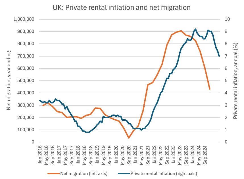
What about housing costs? We know that private rental costs for the UK as a whole have seen a surge over roughly the same period as we have seen higher net migration, following migration numbers with a lag:
What about the local level?
In the chart below we see that not only did rents go up faster relative to income in the later period, but the acceleration was greater in places where the non-UK share of employments grew faster. Again, the scatter is big.
If again, if we look just at non-EU migration, though the scatter is still large, the trend for faster acceleration of rents in places with more migration is even more pronounced. Why I don’t know. The census showed that the employment rate was substantially higher for people from the EU compared to people from outside the EU and work by HMRC suggests the same. So a given number of employments may imply a greater number of people for non-EU migrants, which would imply a greater housing impact.
Instead of rents relative to wages, you could look at simple acceleration in rents - I won’t add more charts here, but the trend is similar.
Conclusions
The new data gives us our best sense yet of how the recent period of high immigration has played out differently across the country. The unevenness of the changes helps to explain why people can have such different perceptions of the issues.
The new data is further evidence against the idea that migration is rocket fuel for growth. The correlation with faster wage growth is just not there. I wouldn’t over-emphasise it, but if anything there is something of a small negative correlation, particularly for non-EU migration.
When it comes to housing and rental costs, there is a lot of scatter, but the trend is pretty clearly towards having faster acceleration in rental costs (and rental costs relative to income) in places where the share of non-UK / non-EU employments has grown faster.
The economic case for a much lower and more selective immigration policy is getting stronger and stronger.
The data is actually at LAU1 - so lower tier local authorities in England, and some large rural Scottish local authorities are broken down into smaller areas.
In February to April 2025 there were 29.43 million people working as employees, while a further 4.40 million were self-employed.
A small number of English LAs are missing too where there has been local government reform.
It’s amazing how much work you have to do to prove what we all knew already 😅. Seriously though, thanks for the work providing evidence 🙏🏻.
Huge uptick for this and all the other carefully researched posts.