
The welfare atlas of Britain
Visualising opportunity costs - and what access to jobs can (and can't) explain
This is the third in a series of posts on welfare reform. Part one, on the growth of spending is here, and part two, on the growth of large claims, is here.
By the end of this Parliament Britain will be spending £177 billion on working age welfare, up from £97 billion in 2020. Where is it all going?
I mean, like, physically where in the country?
DWP does not make it easy to see where benefit spending is going.
So in this post I have pulled out data and calculated spending on each of the largest working age benefits - Universal Credit, and working age spending on Housing Benefit, Disability Living Allowance (DLA) and Personal Independence Payments (PIP)1.
Putting these together lets us make a kind of welfare atlas of Britain.
There are other benefits, so our map doesn’t capture all working age spending.
But I have about £119 billion of spending in the map below, and overall DWP says spending on people of working age and children was just under £140 billion in 2024/252. So it is not perfect, but should be a reasonable approximation3.
Let’s start by looking at local authorities, then we’ll zoom in further.
Local authorities
You can see immediately that welfare spending is intensely concentrated in urban areas. Spend per working age person is nearly three times higher in places like Liverpool, Glasgow and Birmingham than it is in some of the home counties and affluent east midlands.
Even though we aren’t looking at all welfare spending here, the spend in the large urban authorities is huge - there are several local authorities in the billion-pounds-a-year club or just outside:
And these are individual local authorities. “Manchester” in the chart above is just the city centre - Greater Manchester is actually £6.3 billion.
West Yorkshire gets £4.7 billion, Merseyside £3.6 billion and West Midlands Combined Authority a cool £7.1 billion.
Given that these numbers are an underestimate because I haven’t included all the small fiddly benefits, the total spend is likely to be more more like £3.9 billion in Birmingham now.
And given the expected growth, that is likely to rise to just under £5 billion by the start of the next parliament. Even somewhere like Bradford (which isn’t that big) will be approaching £2 billion a year. This is serious money.
Opportunity costs
And that brings me to the point of this post. Why should you care, beyond curiosity? Two reasons.
First, thinking about the sums going to particular places helps us think about the opportunity costs of welfare spending.
The other day Number 10 briefed out that following their defeat by Labour backbenchers they will not be making any further attempt at welfare reform in the near future. So the bills will keep on rising, to £177 billion a year and beyond.
But these national numbers are so large they are hard to get your head around.
It’s easier to think about what a billion quid a year could potentially do to boost growth and opportunity in some of the places above. You could have tax breaks to get big investors into County Durham and Sheffield. London Boroughs like Enfield, Brent and Newham have 50-60 thousand pupils in their schools. They could have class sizes of two or three. With £15 billion over a decade Leeds could finally build its tram without requiring any Whitehall approval. (The tram was recently cancelled by central government for the umpteenth time).
As part of Starmer’s latest relaunch, No.10 briefed out the other day that they would “pump billions” into poorer areas. The truth is government already does “pump billions” into poor places. It’s just in a form (benefit spending) that has not revived their underlying economies.
The second reason I think this data is interesting is to think about how and why welfare dependence can be so much higher in some places than others. The differences with a city or a neighbourhood can be huge.
So let’s zoom in more and look at that.
The constituency level
Sadly, because Scotland doesn’t produce data on its newly devolved benefits below the level of the local authority, we will have to home in on just England and Wales in order to have a fair comparison.
At this level we can see that while Sheffield may have high benefit spending per head in the map above, The constituency of Sheffield Hallam does not. And while Birmingham has high spending, within the city, Sutton Coldfield constituency doesn’t - and so on.
Again, I think it is useful to think about the opportunity cost at this level too.
Tottenham, Brent East and Birmingham Ladywood receive half a billion pounds a year from these benefits alone. What could you do to revive such a small area with half a billion a year? And there are lots of other constituencies in the £400-£500m a year range
It’s also interesting to think about the transfers between places as a result of all this. Tottenham constituency alone gets more than the constituencies of Sheffield Hallam, Wetherby and Easingwold, Harpenden and Berkhamsted, York Outer, Westmorland and Lonsdale, Henley and Thame, and North East Hampshire put together.
Looking at the Constituency level also lets us do some political analysis.
Unsurprisingly, the Conservatives see a lower share of the vote where welfare spending is higher - and Labour sees a higher share. The Lib Dems have a mix, but they do much better in the middle class areas with low spending. Reform do better where benefit spending is higher. The greens do a bit better in higher welfare areas, while the independents (who were mainly Gaza independents in 2024) did best in areas with high welfare spending:
Neighbourhoods
We can continue to zoom in, but things get harder. Frustratingly, the neighbourhood level data for DLA and Housing Benefit is on a different basis to that for UC and PIP.
So let’s just look at UC and PIP spending.
Here’s London. Again, note that the variation between places has gone up - because we’re looking at smaller areas. People used to talk about living on the “wrong side of the tracks”. Well, the river Lea in north London marks a sharp boundary between two very different social worlds when it comes to welfare.
People in Enfield, Edmonton, Tottenham and Stamford Hill are claiming easily twice as much as people on the other side of the river in Woodford, Chingford and Loughton.
Why does this matter? It shows the limits of access to jobs as an explanation for social differences. These are people are living in the side by side same city with pretty similar access to jobs, but in very different social worlds. While access to opportunity and good jobs is part of the story about high welfare claims in some places, these massive variations show that there is a lot more going on too.
There are, of course, multiple dimensions to what’s going on here. Education, housing, employment patterns and so on. One dimension is ethnicity. The two patches of higher welfare claims north of the Thames in the map above coincide with two areas with a higher black population. And the same is true in Lewisham. But then that correlation is less pronounced in Southwark and Lambeth, so there’s more going on than just ethnicity.

In the 1980s there was a lot of discussion about the “inner cities”. One thing that is notable is that the very centres of our largest cities are now not where you find high welfare spending.
Over recent decades there has been resurgence in the very centres of our large cities with young professionals and some students moving in. But this revival has not extended very far outside the very centres of the city, and the welfare map shows this.
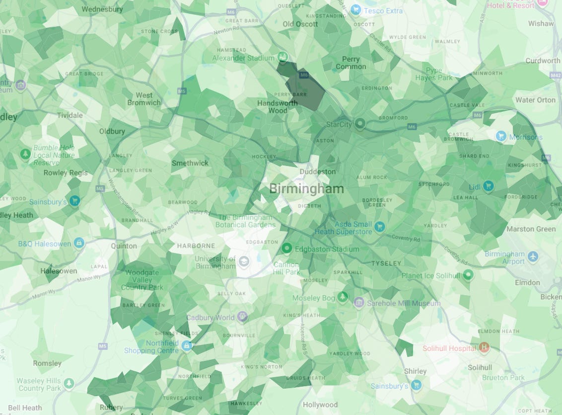
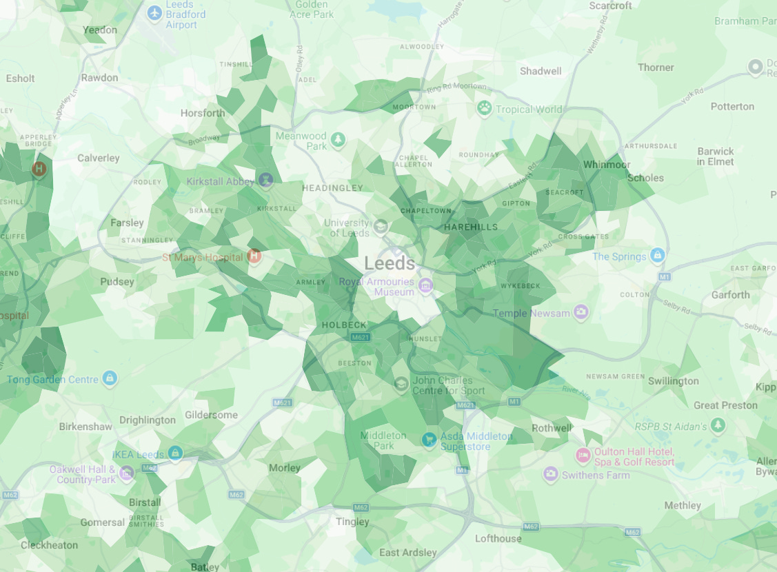
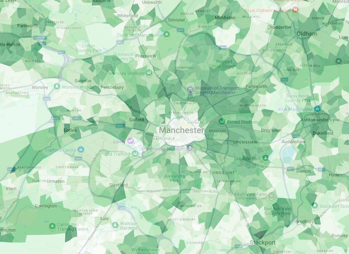
Here is just UC spend per working age person in Birmingham, Leeds and Manchester. As you can see, the very centres of the cities are lighter - the darker green areas indicate larger benefit payments per head. Payments in the very centres are less than £50 per head, but immediately outside the centre it is more like £200 per working age person.
So you can see that our city renaissance doesn’t go far beyond the city centres. 10 minutes out from the centres people are claiming a lot of benefits. It is different for smaller cities which have seen less revival - for example, Bradford has large payments in the very centre too.
Conclusions
Before coming to office in 1997 Tony Blair promised to cut what he called “the bills of social failure” - and while the welfare bill actually went up on his watch, at least his argument was right - taxpayers’ money that you are spending mopping up problems is money you aren’t spending on preventing those problems.
Obviously we can’t just overnight shift all of the large bill for working age welfare into more productive uses. But over time we need to control welfare spending if we want to have the money for other things that can get the economy moving.
I have written before about getting growth going in poorer places and spreading opportunity. People sometimes moan about poor places receiving lots of taxpayers’ money - but the truth is that that money often comes in a form (welfare) that doesn’t help change their trajectory. It may even compound it in some cases.
The Starmer government is showing how limited the room is for tax increases, with the economy sagging most in the sectors hit by the biggest tax hikes. More tax increases will be counterproductive. So if we want the firepower to fix broken places, we need to look to control spending instead. If we could cut the ever-growing welfare bill then maybe we could get somewhere.
DLA and PIP are in the process of being devolved in Scotland so I have added in the new Scottish equivalents.
There’s another £10 billion or so of passported benefits on top, according to a recent Onward report.
I have annualised figures for May 2025 for UC, PIP, HB and DLA (the most recent figures for DLA), and used whole year numbers from Statistics Scotland for Adult and Child Disability Payments. Population figures are mid-2024, the latest I could find, extracted from NOMIS.
The main argument in this series and well documented in this particular post seems to me to be that the Conservative governments between 2010 and 2024 have been inflicting socialism on the UK for 14 years by giving away excessively generous benefits thus redistributing over a hundred billions every year from tory voters to leftist voters. I guess that many tory voters reading this will be quite outraged.
Wow, that River Lea line is dramatic, at first sight you'd think there was an error in the data. It is also notable that it is completely invisible in the ethnicity data.